Xfinity Iconography System
Client
Comcast
I led iconography for the entire Xfinity ecosystem, managing and growing a library of 200+ icons deployed across the Xfinity app, xfinity.com, marketing, and physical hardware.
Teams across product, UX, and marketing came to me directly when they needed new icons created. My process for each request: sketch, research existing patterns, design, and deliver production-ready assets in Figma.
Role: Brand Designer — iconography ownership, system management, production.
Tools: Figma, Adobe Illustrator. Client: Comcast / Xfinity. 2021–2024.
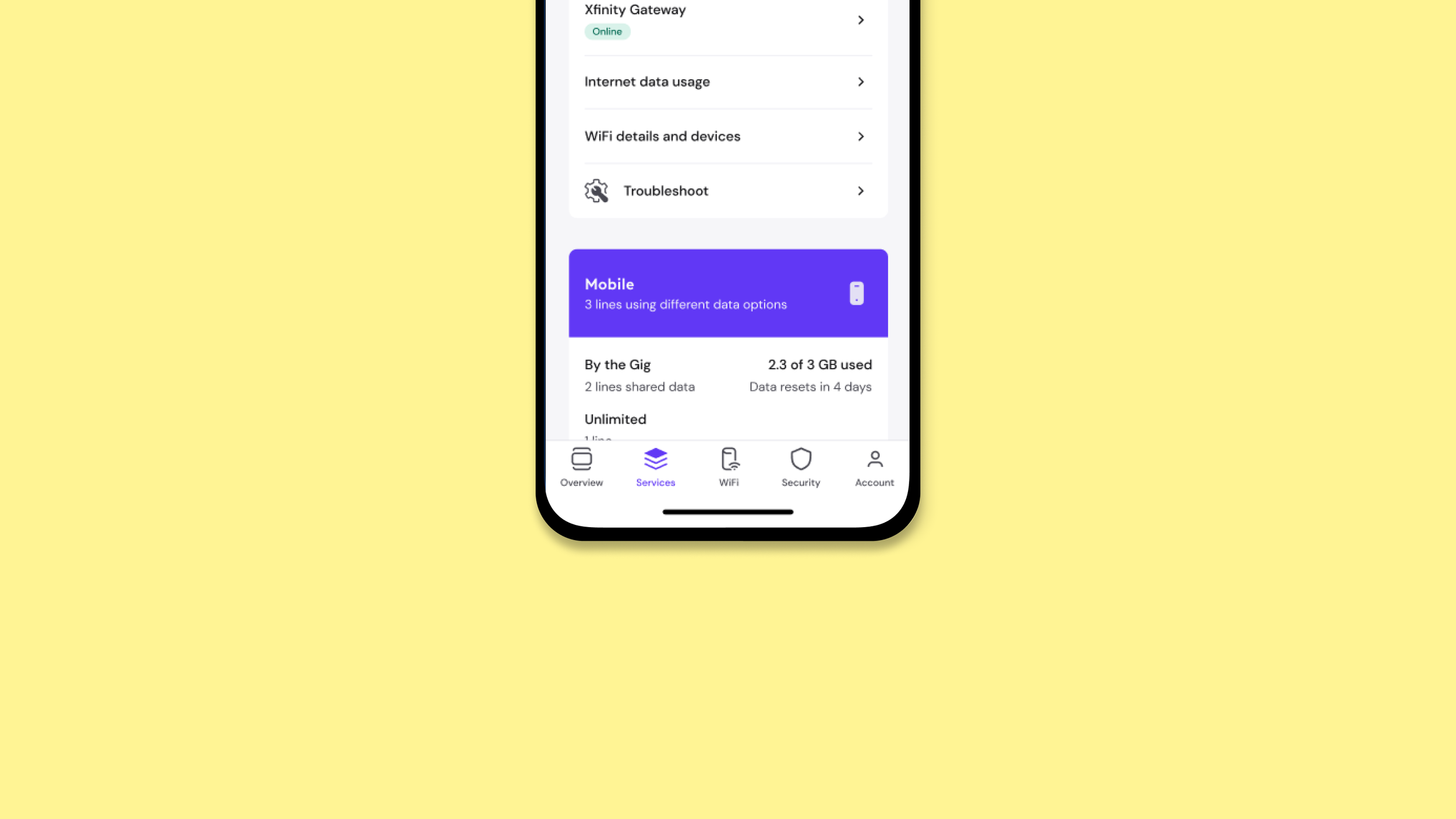
Navigation Bar - Xfinity App
Beyond the app, I owned the broader Xfinity icon system as it scaled across surfaces. When a team needed a net-new icon — for a product feature, a marketing campaign, a hardware label — I handled the full request cycle: understanding the use case, sketching concepts, designing within the established visual language, and handing off production files. Over three years, I grew the system to 200+ icons, 30 of which I designed from the ground up.
Navigation Bar


For the Services tab in the Xfinity app, I designed the illustrated icon set from scratch — exploring five distinct visual directions informed by user research data. Each direction took a different stance on style, from outlined to illustrated to filled, testing how personality and usability could coexist at small sizes. The final selected set was chosen for its balance of warmth and legibility, making navigation faster and more intuitive for millions of Xfinity customers.